
Review Hitwe
Hitwe is an introvert in the world of dating sites. The service avoids positioning, as other sites do, declaring its nature on the main page. “A social platform for meeting different people” – these are the words the resource greets the user with. There is no usual emphasis on sponsorship from services for kept women. There is no direct hint of a romantic component. This is a completely dating site, devoid of euphemisms, accents, and lengthy allusions.
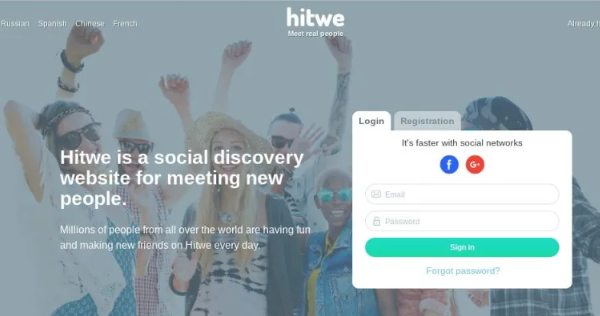
REGISTRATION
The main page of the site pampers the user with six available languages and variable registration. Unlike Badoo, which changes the background screen when you change languages, changing the language in Hitwe is aimed exclusively at text. On the right is the registration block, divided into the classic path indicating the mailbox, and quick registration via a social network. By tradition, let’s start with the first option: Name. This way the questionnaire will be displayed on the E-mail website. A genuine and current mailbox is required to confirm registration. Password. Floor. Age. Captcha tick. Registration ends with adding a photo. The procedure seems optional, but without a photo you won’t be able to fully use the site’s interface. Registration is very fast, but it accelerates to completely indecent speeds with the help of the social networking block. To use this method, you need to select one of five available resources: Facebook, Google+.
The personal data specified in the mail is linked here. After clicking, you must allow account connection. The site will contact the specified platform, copying the personal data and photo from there. Nothing more is required; registration ends after pressing the button.
DESIGN
The first thing that catches your eye are two ad blocks blocked by the browser. Ads can be hidden, but the blocks themselves can only be removed by purchasing a premium account. This is a terrible solution, not only is this approach rarely found today, empty blocks disfigure the site, which would not have been attractive without them. The inhospitable color scheme is conceptually close to blocks. The gray color is depressing; the site does not look friendly or open to the user. Gray can be attractive, but definitely not in this configuration. The only bright spot remains the Hitwe logo, mockingly painted in all the colors of Google.
FUNCTIONAL
On the left is the site control block. The main page opens with a likes tab, so they should be considered first. A standard swipe service, differing from similar ones only in minor details: Button to return to the previous profile. Some dating sites do not introduce this function at all, and those that do often make it paid. Getting back a swiped profile is sometimes really important, which forces you to buy the service. Hitwe has made returns completely free, but you can only return one item. Keyboard control is assigned to the “3” key. Skipping the questionnaire. Keyboard control is assigned to the “2” key. Like. Keyboard control is assigned to the “1” key. Settings. Select gender, age and city. Button to report a photo and add a blacklist. Your favorite profiles are displayed here. The swipe service is the only interaction window. There is no regular search. The service is not focused on itself; actions performed here are reflected on other tabs, which will be discussed later.
MESSAGES
The site really likes to add different blocks to places that are not intended for them. Likewise, in the messages tab, half of the space is reserved for advertising paid services. Top users. A function similar to the photo feed on other dating sites. The developers did not place the block in the header of the site, preferring to hide it in messages where it had no place at all. Sorting windows by dialogues, favorite contacts and likes. Without the dialogue setting set, all likes sent to you will appear in the window. On the one hand, this clogs up the chat, on the other hand, the solution is interesting and encourages you to write in response to a sign of attention. Sorting by unread and recent messages. Message filter. An extremely useful feature. Half of user complaints concern rude men and dubious offers from them. The filter will allow you to prohibit certain categories of people from writing. Available criteria: gender, age, ban on incoming messages from people without photos, and ban on incoming messages from users of other countries. The screenshot was specially taken to capture the area of advertising blocks. They take up an enormous amount of space, which affects the font size and ease of use of the chat. Here there is a button for photos of the interlocutor, adding him to contacts, a like (functionally identical to like in likes), a link to the profile and an icon for sending a complaint. At the bottom there are two buttons with emoticons and a connected third-party plugin with gifs, which will diversify the discussion quite well. However, the font is too small, it could have been enlarged, but the block solution makes that idea a no-brainer.
WHO LIKE ME
Love display window with a one-month shelf life. Access to your profile is only available after purchasing a premium account. But there is a loophole here. The sent sympathy is reflected in the message window, through which you can go to the profile for free – the avatar is not darkened enough so that it cannot be recognized in the list of dialogues. Such a bug deprives developers of part of their profit, since one of the motivations for purchasing premium disappears. Such frivolity does not suit the site.
VISITORS
Similar to the previous window in application, the guests tab does not show sent likes, but regular profile transitions. Guests can only be viewed after purchasing a premium account. The tab should have been connected to the previous one, without creating unnecessary links on the main page of the site.
MUTUAL SYMPATHY
Mutual likes between two users light up notifications on this tab, inviting them to start communicating. Clicking on the photo takes you to the message window. Often, mutual liking is closed without purchasing a premium account, since liking is a very powerful argument for dating. Here this feature is completely free.
TOP USERS
Each like given to a user does not go unnoticed – according to their number, places in the top users tab are distributed. At the top there are four sorting buttons. You can additionally like profiles or go straight to dialogue. Clicking on the photo takes you directly to your profile. However, in free mode only sorting is available. Writing messages, liking and going to the user’s page are only available after purchasing a premium account.
RIBBON
The name should not be misleading – the feed does not introduce a social component, it is just a window of updated photos. Actions are limited to liking, going to the profile or to the message window. However, the function can be used as some kind of compensation for the lack of search. Profile settings are not tied to age, but the sexual preferences indicated in your profile are fully taken into account.
CONTACTS
Another tab that should have been nested within others. Users added to contacts are located here, there is no sorting, but there is a search by name. The tab does not provide any other options.
PROFILE
A very informative profile, divided in two by an advertising block crossing it. Despite the complete uselessness of the information you fill out due to the lack of search, your personal data allows you to find a common language with people with similar interests. Name change. You can change an unlimited number of times. Counter of visitors, outgoing and incoming likes. This block hangs on every profile in the public domain. Basic information: age, gender, language proficiency and city of residence. A mocking call to leave feedback with recommendations for improving the site. Theoretically, a campaign could be launched to combat pervasive ad blocks. To fill out the form in detail, there is a tab panel under the avatar: Photos. The number of photos is limited to 20, but for premium users the limit increases to 30. Interests. A large tab where you can choose your attitude towards animals, people, favorite music, books, games, hobbies and more. Notifications. All incoming likes, messages, page visits are collected in this form. The button seems superfluous, because it simply duplicates other site tools. Information. Preference settings and personal information. Ethnicity, religion, orientation, relationships, children, animals, real estate, work, education, habits. At the bottom there is a power button, you can specify veganism. A similar point is not found on other sites.
SETTINGS
The developers again approached the layout in a unique way. The number of links inside the tab should not be misleading – each of them hides one setting; they could be added to one vertical list. Notifications. You can disable help, email notifications, sound for likes and messages, and also enable browser pop-ups. A filter similar to the filter in the messages tab. The only security is changing the password. Black list of users. Deleting a profile. Purchasing a premium account.
PAYMENT AND PAID SERVICES
The only paid service on the site is premium status. There is only one way to buy it – using a bank card. The prices are quite affordable, the cost decreases when choosing large packages: Week – 2 $. There is no personal account on the site, so the service is purchased directly. Premium status provides the following benefits: Shows user likes. Removes advertising. Increases the limit on uploading photos. You can write to top users. Marks sent messages, bringing them to the top of the list, which will definitely affect the likelihood of a response.
ADVANTAGES AND DISADVANTAGES
Let’s look at the disadvantages: Naturally, advertising blocks. They follow you from tab to tab, spoil the interface, invade other tabs, and bring dullness, melancholy and destruction. Lots of unnecessary buttons in the menu on the left.
Pros: A convenient and honest solution to combine all paid services under one premium status. The premium cost is really very low. Free guests and mutual sympathy. Mobile app.